Tuesday, March 30, 2010

ColourQ Challenge #26 + an exciting announcement!

Having just seen Alice in Wonderland this weekend, I can't get the image of Helena Bonham Carter with her big head out of my mind when I announce this but here it goes...

There is now a design team for the ColourQ Challenge and guess who's in the Royal Court?!  Me - along with a wonderful group of very talented crafters.  Be sure to check out all of their blogs from my sidebar along with the current weeks challenge.  I promise I don't have a big head like Helena but I am honored to have been asked.

On to this weeks challenge:


How adorable are those booties!  Here is my take:


As usual I kept the background simple and neutral.  I love how the little bird from PTI's Bird Watching Additions works with this branch from PTI's Turning a New Leaf.

Thanks for stopping by and be sure to play along with this weeks challenge!

Supplies
Stamps:  Papertrey Ink
Punch:  EK Success

Monday, March 29, 2010

Papertrey March DT Challenge

Nothing like waiting until the last minute!  If you haven't seen the post with this months beautiful color combination challenge be sure to check it out here.

I decided to use Lisa Johnson's color combination because I just received a new pack of Sweet Blush paper that was itching to be used - plus it has Kraft in there too ;).

I used my Through the Trees set and I challenged myself to make a card using each of the main tree images.  Here is the first and probably my favorite:


Next is a design that is basically a copy of Nichole's creation that made me say "I must have it":


And last was this little square card that really does look better in person - the embossing just gets a little lost in the photo:


All supplies are from Papertrey Ink.

Sunday, March 28, 2010

My encore presentation of the Curtain Call Color Challenge #22

I totally missed the deadline for posting this challenge but it won't stop me from sharing!


Here is my "encore":


All supplies from Stampin' Up.

Saturday, March 27, 2010

ColourQ Challenge #25

What a great spring color combination for this weeks challenge:


I immediately knew I wanted to use my new chocolate bunny stamp for this and I like the way the colors overlap on the eggs in the inspiration photo.  So I stamped Tempting Turquoise onto Certainly Celery to try and replicate that look:


(The bunny is stamped with Chocolate Chip onto Close to Cocoa - perfect chocolate goodness!)

Supplies
Stamps:  Stampin' Up, Anna Griffin
Ink:  Stampin' Up
Trim:  Making Memories

Tuesday, March 23, 2010

Polka Dot Basics 1.5 Version 2

I knew I would be addicted to these dots - if you missed my original essay on their discovery look here.

So this weeks Cards Blog challenge to use eight or more colors immediately made me think of a rainbow of glorious rows of dots!  I'm going to assume that black and white count as colors for this (otherwise I'm a color short).

I just opened up my Bold Brights cubes and starting picking.  Then I went in search of a large sentiment that would fit in my cute new label/die combination - well hello Say It With Style!  A perfect fit.  I think it holds its own against the busy background.


Supplies
Stamps:  Papertrey Ink
Dies:  Papertrey Ink
Ink:  Stampin' Up, Versafine

Monday, March 22, 2010

When you know they're going to throw it away...

Kids birthday cards probably always meet the trash can at some point, right?  So I hate to spend tons of time on them but they still need to be cute.

"Cute" isn't really a word I would use to describe by crafting style so I've been trying to find some appropriate stamp sets that I can use for kids cards.  And thanks to the clearance endcap at Target I just found a great one!  At 75% off - a mere $2.48 - this may just be one of my best stamping bargains ever.  Especially now that I've used it and been super duper happy with the results!


The set consists of quotes like this one along with a variety of kid-friendly images like the heart.  I just stamped and added the line around it with a black marker.  I love that black marker trick!  Either by hand for a messy look or with a ruler for a neat look - somehow it just makes things look "finished" to me.

The second one didn't photograph as well - the purple butterfly looks really light - but it's equally as cute in person.  Pinky swear.


And you certainly cannot argue with that quote!

Supplies
Stamps:  Autumn Leaves
Ink:  Versafine, Colorbox

Sunday, March 21, 2010

Poppy Seed Challenge #2

Major A-HA! moment for me with this card!!  More about that later...

I'm making the Poppy Seed Challenge on time this week:

Another excuse to use new Papertrey goodies!  This time I wanted to use the Delightful Dahlia set - but I couldn't make it work with the button part of the challenge so I decided to put at least one of the GIANT buttons that come in Papertrey's vintage button packs to use:


Now the A-HA moment.  One of the first sets I bought from Papertrey was the Polka Dot Basics set.  It's a great set but soon Polka Dot Basics II came out and I began lusting after it's cute, cozy, smooshed together dots.  But my wishlist is far too long to buy another polka dot set so I've just had to make it work.

So when I stamped the first set of dots I said to myself, "self, it looks like there is enough room in between the dots to offset this stamp, stamp it again and make a bunch of cute, smooshed together dots".  So thinking I was so smart that's just what I did - only it doesn't come out looking anything like Polka Dot Basics II.  Dare I say I like it even better!!  Cute little lined up rows of dots!

Polka Dot Basics III (or maybe Polka Dot Basics 1.5) - you saw it here first folks!

Honestly, I'm sure I'm not the first one to figure this out but let me bask in the glow of discovery for just a minute more.

And just because I couldn't help myself at this point - I made another card with the Delightful Dahlia set (it just doesn't qualify for the challenge - no buttons):


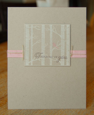
For the record both of these cards were made on Soft Stone cardstock (although the first one looks off to me).

Supplies
All Papertrey ;)

Saturday, March 20, 2010

ColourQ Challenge #24

So this weeks challenge was a little tricky for me because I don't usually buy much in the way of in colors.  I have never taken the plunge with inks so it's cardstock only.


I had just received a Papertrey order and really wanted to use the Life set I just purchased but the idea in my head involved lots of white cardstock and colored ink.  I think I need to just suck it up and buy the in color inks - I wish they would just make a little set of cubes!

So I ended up with this:


The buttons ended up there because it just looked naked in that corner.  I really do love the Apricot and Coral together but I couldn't get the original idea out of my head so since everything was already out I made a few color substitutions and came up with this:


Ah - better.  In place of Baha Breeze I used Sage Shadow and in place of Rich Razzleberry I used Bravo Burgundy for the sentiment.

My tendency when it comes to color combinations like this is to use lots of one neutral color and little bits of all the other colors.  I have a hard time using a significant amount of any one color mixed with that many other choices.  Then I see other peoples cards and realize it can totally work - just not when I do it!

Supplies
Stamps:  Papertrey Ink
Ink:  Stampin' Up
Buttons:  Papertrey Ink

Friday, March 19, 2010

When it rains....

Well that saying has fit our lives perfectly here.  In the last two weeks I've had 5 assignment projects to complete, 4 cases of the stomach flu (one for each family member), 2 funerals and 1 surgery for our eight year old.  Needless to say time for cardmaking just for fun was all but lost.

Hopefully things can get back on track this week!

Today I'm going to share a card I made for a challenge that ended somewhere around the time all the above mentioned craziness began.  This was a new challenge I found at Poppy Paperie (if you click here it will take you to the current challenge that is going on now).  But the first challenge was to use a flower stamp, yellow and some bling.  Here was my poor little entry that never had a chance to participate:


I love how "spring-y" it turned out (especially since we have been enjoying very spring like weather here the last few days!)

Thanks for hanging in there with me - hopefully we'll be back to regular posting now!

P.S.  I was recently asked in the comments if I sell my cards.  I do but right now it is only locally.  I would love to try and start selling them online but really have no idea the best way to go about doing that - does anyone have any tips or suggestions?

Supplies
Stamps and Paper:  Papertrey Ink
Punch:  Fiskars

Saturday, March 6, 2010

Oops!

What happened to Good Morning Sunshine days 4, 5 and 6?!  "Somebody" goofed on the publish date so it looks like we will be combining them together today instead.  Good help is so hard to find these days.


It doesn't get much easier than a piece of pattern paper, a scallop edge punch and a greeting, right?

Supplies
Paper:  Stampin' Up
Punch:  Stampin' Up
Stamp:  Papertrey Ink


Or you could go crazy and add an extra color!

Supplies

Paper: Stampin' Up
Punch: Stampin' Up
Stamp: Papertrey Ink


Or a sweet punched butterfly!

Supplies
Paper:  Stampin' Up
Punches:  Stampin' Up, Martha Stewart
Stamp:  Papertrey Ink


I hope you enjoyed this series of cards and it gave you some ideas on how to use  patterned paper and still end up with a clean and simple card.

I had to devote my crafting time to assignments this week so I didn't have a chance to participate in many challenges - which I really missed!  Hopefully I can get back on track this week!

Thanks for visiting!

Wednesday, March 3, 2010

Good Morning Sunshine - Day 3


This card is similar to my first card but with a little more color included in the pattern ( and a differnt orientation).  The dominate color in the paper is green so I used that for my background.  I brought out the blue with a small scalloped edge rather than using a punched shape near the sentiment.  The little dots below the sentiment came with the set and are nearly the exact size of the dots in the pattern - love it when things like that happen!

Supplies
Paper:  Stampin' Up
Stamps:  Papertrey Ink
Punch:  Stampin' Up

Tuesday, March 2, 2010

Good Morning Sunshine - Day 2


Todays card has a totally different look!  I've ended up making a slew of cards using variations of this layout.  Even though the pattern is much busier than yesterdays, using it in a smaller dose still helps to keep the card simple.  The size of the patterned paper is about 2 1/4 x 5 1/8.

Thanks again for looking!

Supplies
Paper:  Stampin' Up
Stamp:  Papertrey Ink (a great sentiment set for only $5)
Punch:  Stampin' Up
Felt Ribbon:  Stampin' Up

Monday, March 1, 2010

Good Morning Sunshine!


I have a series of posts scheduled for this week all using this Good Morning Sunshine designer series paper pack from Stampin Up'.  Last year I purchased a sampler that included a 6x6 sheet of all the new papers.  My intention was to make mucho cards with it but I've not really followed through with that plan.  So I'm going to try to do a few of these "series" with different papers to force myself to use these poor papers that have been collecting too much dust.

I sometimes have a difficult time using patterned paper on my cards - I tend to want to use bitty little pieces so it doesn't seem too busy.   So I'm trying to design some cards that really let the paper be the focal point.

For todays card I just used a piece of patterned paper trimmed to 3 1/2 X 4 3/4 leaving a nice little border around the edge.  This is where I love all the coordination with Stampin' Up products - a tone on tone pattern on a matching cardstock still leaves me with a nice, simple card.

Thanks for looking and be sure to check back to see more the rest of the week!

Supplies
Paper:  Stampin' Up
Stamps:  Papertrey Ink
Related Posts with Thumbnails